Category Archives: Learning

First Person Narrative: Writing Tips

Excerpt from “First person narrative: 7 tips for writing great narrators” by NOW NOVEL

1. Evoke the senses, not only the narrator’s inner world

Writing a novel or story in the first person makes it tempting to let your narrator dwell on their thoughts and feelings extensively. Often characters can feel lacking if all the focus is on their mental and emotional processes, though. Have your character describe not only thoughts but also sights, sounds, smells and tastes where appropriate.

When you use a first person narrator, ask:

  • What senses are strongest in this particular character and what does that say about them?

  • How can I give the reader a greater sense of an embodied narrator and not just a disembodied, storytelling ‘I’?

Remember to ground your narrator’s observations in the material world. Because this will add colour and depth to your story.

Focusing on all aspects of your narrating ‘I’ character’s experience, physical and otherwise, is one way to write a great narrator. It is also important to let readers see through your narrator’s eyes actively:

2. Avoid overusing words that place distance between the narrator and your reader

Because the narrator uses the first person ‘I’ (and sometimes the plural ‘we’) to tell the bulk of the story in first person narration, you may be tempted to begin sentences with ‘I’ a lot. Take this sentence for example:

‘I saw that the door was closed and I heard a faint scratching noise coming from within the house. I thought it sounded like someone trying to dig a tunnel out.’

The words ‘I saw’, ‘I heard’ and ‘I thought’ all place the reader at one remove to the unfolding events. The reader isn’t seeing, hearing or thinking these things through the narrator. The reader is being told about the narrator’s experiences. The scene could be more vivid if the narrator didn’t ‘report’ her or his experience.

The snippet could be rewritten as follows:

‘The door was closed and a faint scratching noise came from within the house. It sounded like someone trying to dig a tunnel out, I thought.’


Continue reading First Person Narrative: Writing Tips

category:

Image Resolution Explained

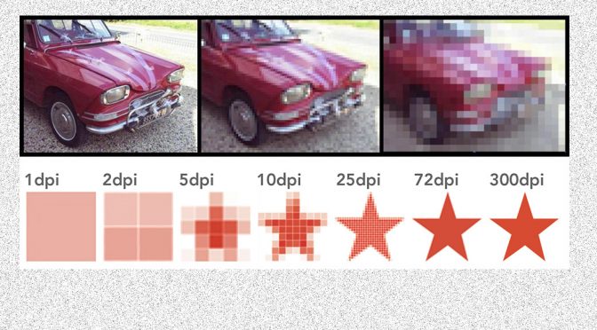
Pixels determine the image size on a screen

Digital images are formed from lots (tens of millions in some cases) of different coloured dots, known as pixels. The pixels are tiny and tightly packed, so when viewed on a screen, the individual dots are not noticeable, giving the illusion of a perfectly smooth yet sharp image.

It so happens that computer screens are made up of pixels too, so it is reasonably easy to predict how much space an image will take up on a screen.

Example

Let’s use this picture of Archie. This is one of our free downloads, and is 300 pixels wide x 400 pixels high.

Example image 300 pixels wide x 400 pixels high

Example image 300 pixels wide x 400 pixels high

If we imagine a computer monitor that is 1300 pixels wide x 800 pixels high, this picture will take up this amount of space on the screen:

300 pixels x 400 pixels image on a 1300 pixels x 800 pixels monitor

And here is our “medium” sized picture of Archie which is 480 pixels x 640 pixels:

Example image 480 pixels wide x 640 pixels high

Example image 480 pixels wide x 640 pixels high

See how this image takes up more space on the screen:

480 pixels x 640 pixels image on a 1300 pixels x 800 pixels monitorAnd what about our “high resolution” version of this image (3024 pixels x 4032 pixels)?

High resolution image

As you can see, the high resolution image is much bigger than this computer screen. So does this mean that you never need high resolution images for screen use? In many cases, that is correct, one of the smaller versions is likely to suffice. However if you were using an image for a full screen background, you may well need the high resolution version, but might want to reduce its size yourself.

3 Actions Steps To Help You Decide What’s The Best Resolution For Your Photo Scanning Needs

  1. If you use 300 DPI, you’ll be safe. You’ll get HDTV quality images. And you can re-print them out at the original size.

  2. But if you want to double or triple the size of your original photo, use 600 – 900 DPI. And it’s always better to have too many pixels, than too little. I personally scan all my 4×6 photos at 900 DPI.

  3. If you have photos smaller than 4×6, use 900 DPI or more. I personally use 1200 DPI to scan all my smaller photos.

category:

Visual Impact

What are the visual qualities that best capture one’s attention?

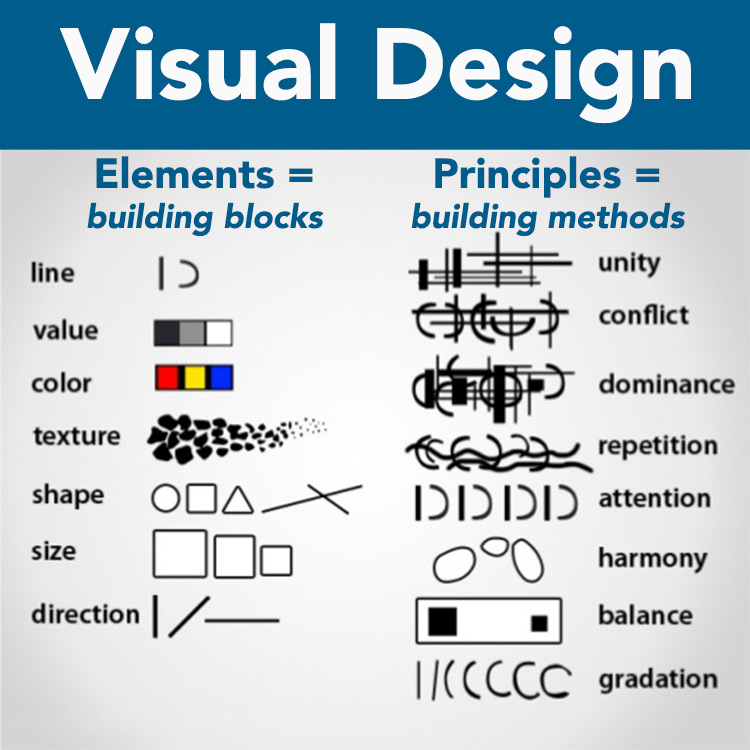
Visual design elements and principles describe fundamental ideas about the practice of visual design.

outline showing design elements and principles

Elements of Design = Line, Shape, Color, Tone, Texture, Direction, Size

Design elements are the basic units of any visual design which form its structure and convey visual messages. We can think of the elements of design as a collection of abstract tools. They can be combined and arranged in any way we like to create some sort of visual statement. The elements of design are the raw materials or building blocks for any form of visual expression.

Diana Eftaiha outlines how these design elements can turn a simple subject into a striking photo in her article:  6 Elements of Design .

Principles of Design = Contrast, Harmony, Balance, Repetition, Dominance, Gradation, Unity

Design principles integrate design elements into one composition. How one applies design principles determines how successful a design may be. Important considerations are:

Focal point – the center of interest of the design. Be aware of where you want the viewer’s eyes to look.

Contrast – engages the viewer by making the design more visually interesting.

Balance – the use of space in the distribution of objects and colors. The sense of balance or symmetry affects the viewer’s emotional response. For example, a perfectly symmetrical design may result in tranquility or boredom while an asymmetrical design may create excitement or anxiety.

Rhythm – the use of lines to direct the viewer’s eyes around the page or screen. Vertical, horizontal, and diagonal lines direct the eyes in different directions and convey different emotions.

Perspective – providing a sense of depth (usually thought of in terms of foreground, middle ground and background). Methods for providing perspective include using a horizon line, relative size and scale of objects, linear perspective (converging lines to convey distance), and color and value (darker, richer colors appear to be in the foreground).

Unity – consistency and cohesiveness in the overall design. Everything works together to make one unified whole.

Trent Sizemore outlines how to effectively incorporate design principles into photography in his blog post The Principles of Design in Photography.

category:

How to Write Winning First Person Stories

Excerpt from “How to Write Winning First-Person Stories
by C.S. Paquin

The essence of good first-person narrative is sharing an experience, letting the reader see and feel it, and reaching a resolution from which both reader and writer grow or have an ‘aha’ moment. Writers often confuse essays with a recollection of an event — they fail to share how the experience enlightened them, affected them, changed their opinion. An essay is an internal journey of discovery. To work well, the reader takes that journey with you.

What to write

The topics are endless. Almost anything can be the subject material for an essay — nature, climbing, sailing, death, parenting, relationships — but ask yourself what you feel passionate about, or what you have experienced that has universal appeal. Ask yourself what makes you happy, or what makes you sad. When you have a clear idea of what you’d like to share, begin a draft.

The draft

The draft essay is the first step in clearing your head for a final, tightly focused piece. Don’t hold back in your draft, don’t critique it, just let your emotions and thoughts run unchecked. Write where you are comfortable; perhaps try longhand if you usually type. Then, when you think you’ve said all you can say, close the file or notebook and walk away.
When you’re ready, perhaps in a day or so, read your draft. You’ll find paragraphs that make you wince, and others that shine with brilliance. You might find you sound dogmatic or overly emotional. It’s good to recognize this now before you submit your piece. If you don’t, the editor will.

Many essays for commercial publications are not lengthy — perhaps 1,000 to 1,200 words, often less. To share all you want to share, you must keep focused on three elements — the beginning or hook; the conflict or the internal journey; and the ending, what you find at your destination.

1. The hook

Look at your first draft and see what parts of it are crucial to set the scene — people, places, events — and what will distract the reader with unnecessary detail. The balance lies in giving the reader enough information so they can know you at least a little. Remember, your neighbors, spouse and children may be familiar with you and your experience, but your readers are not, yet are about to embark on an intimate journey with you. On the other hand they don’t want tedious details about your Aunt Marge or her canary, unless they’re coming on the journey too.

The most successful essay I’ve published had this introduction:

I sob in Sydney International Airport as my 5-year-old daughter Bee and I bid our friends and family an emotional farewell. At age 30, I am leaving my native Australia, after a whirlwind romance, to join my husband in his native Minnesota.
Immediately, the readers (Minnesota Monthly) knew they were going to hear about a physical journey as well as the internal one, and the key players were myself, my daughter and husband, and a relocation to Minnesota.

What wasn’t important in this piece is what got to me the airport — why my daughter and I were going to Minnesota, and not my husband to Australia, or whatever. What mattered was that I was at the airport, and that I was leaving.

If you are writing about coping with infidelity, don’t talk about the ten good years before your ex-spouse’s affair; start from when you discovered the betrayal.

In short, begin with the phone call, the letter, the diagnosis, the news, and the event… not what led up to it.

2. The journey

We’re packed, ready and off we go. This is where we experience your challenge or conflict with you, grapple with the curveball, struggle to make sense or laugh or cry with you. To recapture your emotions and make us feel them, the body must be lively and interesting. Again, don’t bog down your story with unwieldy descriptions; keep focused on your emotions and the drama to keep the reader moving forward. Make sure you occasionally remind of us of the theme of the journey, but succinctly.

It’s OK to pause, recollect your thoughts, or comment on where you thought this journey may have led you, but you do have to press on. You’ve taken us this far and we’re engrossed, so you have an obligation to see us to the end.

3. The destination

Aah, so we discover that it is possible to survive a Minnesota winter; a broken heart; beat the odds; or change a belief about yourself. Tie the ends together, remind us where we were when the journey began and how far we’ve come. The ending or resolution doesn’t have to be happy, but there should be evidence of growth or a new understanding in the author.

And if the reader can apply that growth and understanding to his or her own life, then your essay has achieved its goal — a journey worth taking.

Editing your essay

Now for the hard work! You’ve written what you think is close to a publishable piece, but don’t be hasty in sending it off. Put this second draft away and then reread it, removing yourself from your experience as much as possible. Look for the following pitfalls:

1. Emotion vs. emotional

It’s fine to be angry, sad or happy. We want those emotions, but remember the reader is more removed from your particular experience. If you are too emotional, you will appear to be venting, possibly irrational and to not have grown from your challenge. If you haven’t grown, neither can the reader.

2. Passive vs. active

There is a tendency for essays to be passive because they describe past events, which offers no immediacy to readers and less chance to engage them. Look at your sentence structure, if you have a lot of “was” or “by” in your essay, revise it. Look at the following:

“I was being lied to by my wife” is passive. So break it down: Who’s doing the action? The wife: the wife is lying. What is the verb or the action word? Lying. Who is having something done to it? I am. Sentence structure should be subject/verb/object: “My wife lied to me” — offering less to wade through and bringing the action (the verb) closer to the reader.

3. Adverbs

Writers often think if they use adverbs they’re heightening emotion when, in fact, the opposite is true. Use of words ending in “-ly” weaken prose. If you shout because you’re angry, the reader should know that from your actions and not be told, “I shouted at her angrily.”

4. Show, don’t tell

Sheila Bender, author of Writing Personal Essays: How to Shape Your Life Experiences for the Page, says that a good essay is one with imagery appealing to the five senses. To engage readers, offer enough detail so the audience sees, smells, hears, etc., what you are describing. Don’t “tell” the reader what’s happening; use verbs that “show.” Don’t say, “it was a hot day,” instead, tell us, “the sun beat down.”

category:

Writing Tip: FILTER Words

by Ruthanne Reid as posted on “The Write Practice

What Are Filter Words?

A filter word puts distance between the reader and your character, filtering that character’s experience. Let’s look at an example to get a better sense:

This was magic school? I stood and stared at it; I thought it seemed to be set up to depress us. I saw the green hill rising from the earth like some kind of cancer, and I could hear the voices of students on the wind, chanting soullessly, as if the wonder and awe of true magic had been whitewashed from their lives.

Not sure what to look for? Here it is with the filter words removed.

This was magic school? It seemed to be set up to depress us. The green hill rose from the earth like some kind of cancer, and the voices of students carried on the wind, chanting soullessly, as if the wonder and awe of true magic had been whitewashed from their lives.

What did I remove? I thought, I saw, I could hear. In other words, I removed anything that had you, the reader, looking at her looking at things, rather than looking at the things she saw.

This is true first-person: being behind the character’s eyes.

How to Spot Your Filter Words, with Examples

Filter words can be difficult to see at first, but once you catch them, it becomes second nature. “I heard the music start up, tinny and spooky and weird,” vs. “The music started up, tinny and spooky and weird.” One is outside, watching him listen; the other is inside his head, hearing it with him.

“I saw the dog, brown and shaggy.” You’re watching the character see the dog. “The dog was brown and shaggy.” Now you’re seeing what the character sees, and there is no space between you and the character.

I’m going to give you one more example from my own work.

Continue reading Writing Tip: FILTER Words

category:

Tips for Crafting Digital Stories

Excerpt from “Advanced Thinking in Digital Storytelling” by John Orech

The Writing Process

The foundation of a good digital story is a solid piece of writing that includes a point, dramatic question, and emotional content. In addition to these key elements, I have my students focus on verb choice, observations, and keeping their writing concise.

Precise verbs drive a story.

Action verbs provide a far richer meaning and appeal to the senses better than linking verbs. Looking at my cat Sunny next to me, I might write “The cat was relaxed,” but a better choice would be “The cat lounged on the couch.” Verbs with a definite meaning also help the viewer create a more accurate mental picture of the story. The word “walk” is not nearly as descriptive as “saunter,” “stroll,” “stagger,” “stomp,” or “strut.”

Effective writers must observe carefully.

When viewers observe our stories, they infer meaning. If we make these inferences for them, we cheat our audience. “He was mad,” tells the audience, but “His nostrils flared, his teeth clenched, and his eyes bulged” allows the viewer to draw their own inferences and become a more active participant in the story. Including sensory terms and descriptions allows the audience to create the picture in their minds.

Too much background dilutes a story.

Feeling like they need to set up an entire scene so they don’t confuse their audience, writers often add too much detail. However, a carefully written first sentence can take us right into the story. The viewer will figure out what is happening based on their own experiences.

I had one student who wrote about an incident at a dance camp she attended. Her story initially started with an entire paragraph explaining location, how she got there, when she went, and so on; she transformed the beginning into, “My legs tensed as I waited for my cue; after all the sweat at camp, it was Showtime.” The tone, point, and dramatic question are clearly established: she is a dancer, at a camp, and has prepared for this moment intensely. Now she can tell her story.

Making the Movie

Movement (panning and zooming) can add a dynamic feel to still shots and can aid in developing plot, revealing character, or creating a dramatic effect. When working with my students, I encourage the judicious use of movement. When they grumble about not using video, I share footage from Ken Burns’ documentaries to help explain that brilliant manipulation and stunning effects can be made using still images.

Students need to learn the impact of each movement before they can effectively create interplay between movement and narration.

Continue reading Tips for Crafting Digital Stories

category:

Writing personal voice

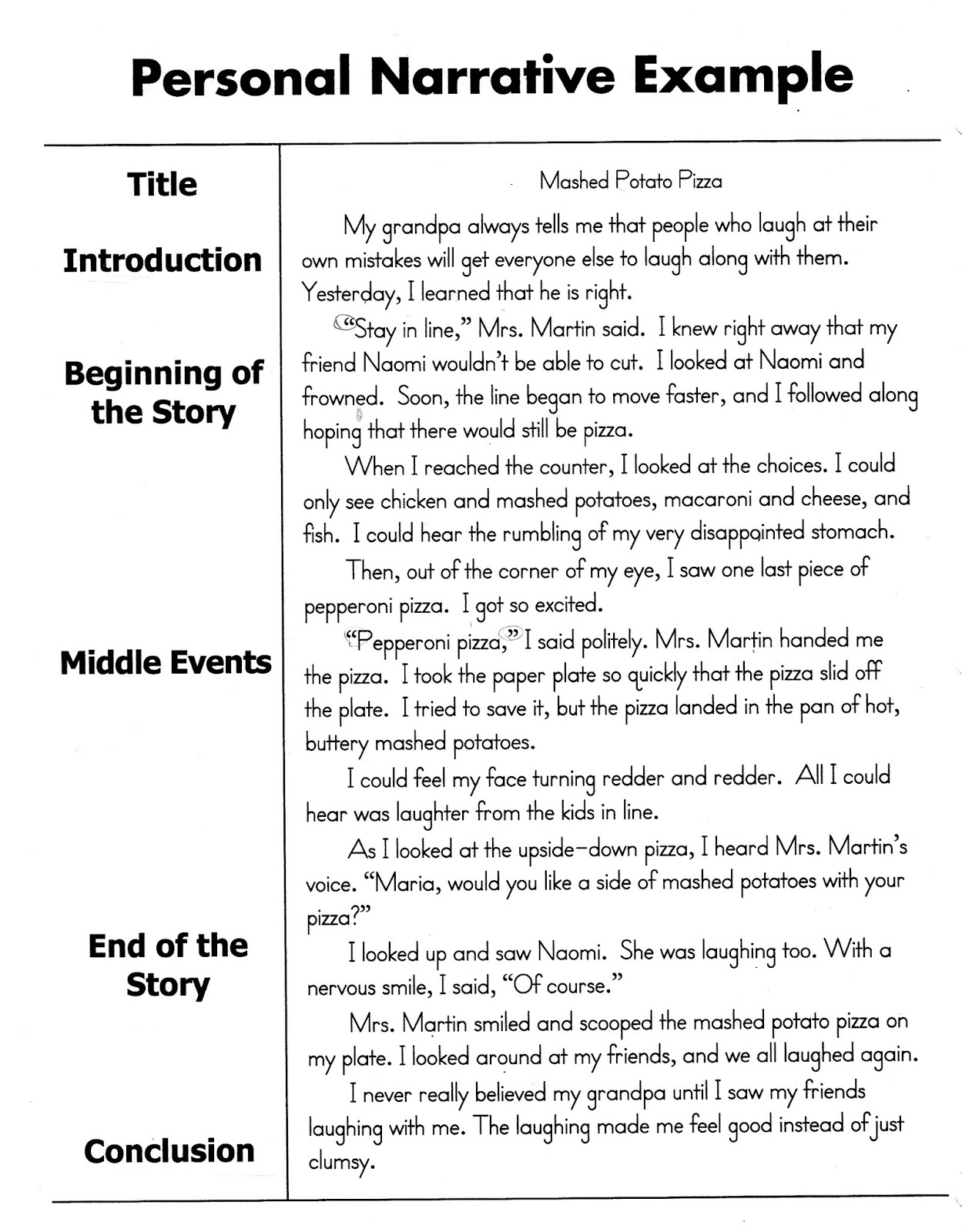
I think this kid’s story “Mashed Potato Pizza” is a great example of effective personal narrative. Check it out and let’s talk.

mashed potatoe pizza -story script

Did you find this story compelling? I did. First I chuckled and that’s always a good sign. But deeper layers emerged too.

To me it is a nice “simple yet profound” blend. We all have been there – being embarrassed in public & being comrades within a group. I liked being reminded about the great value of laughing at yourself.

To me this story follows the essential aspects outlined in my post Key Ingredients of Digital Storytelling.

It is a personal experience expressed using conversational language. There is emotion and feelings … impatience, hunger pains, and misfortune  to name a few. The story effectively conveys an unfolding scene taking place in a school lunch line. There is effective story contrast. Do we get pizza? We got pizza! Arghh … dropped pizza! I especially like the contrast between deep dismay and deep laughter.

This story on paper effectively evokes pictures and sounds in our heads. What would this look like as a digital story?

category:

Layers of Visual Language

The visual vernacular can be drilled down into two forms of expression: Explicit and Implicit.

EXPLICIT imagery:
literal or direct images used to illustrate a story

Explicit imagery is useful for conveying the necessary details of your story or helping to set the scene for your audience. For example, as you tell a story about the family farm, you show a picture of a farm to directly transport the audience into the setting of the story

IMPLICIT imagery:
implied or indirect images used to illustrate a story

Implicit imagery is useful for implying or representing another meaning beyond explicit or literal meaning. For example, colorful autumn leaves used to illustrate vital aging.

Two techniques to convey meaning through implicit imagery are visual metaphor and juxtaposition.

VISUAL METAPHOR utilizes symbolic representation. For example, a picture of a flower growing out of a concrete sidewalk to illustrate overcoming a personal challenge. Audiences connect the emotional content of the struggling plant with the storytellers struggle.

JUXTAPOSITION utilizes image choice and sequential order. For example, consider the different meaning of a picture of a crouching tiger followed by a picture of a deer herd versus the crouching tiger followed by rifle scope. One combination illustrates a feeling of power while while the other evokes vulnerability. Audiences interpret the juxtaposition of visual images as having implicit meaning that goes beyond what each image explicitly means on its own.

category:

What is a Story Arc?

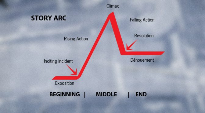
Each story is unique, yet all stories can be boiled down into three distinct “acts”: beginning, middle, and end.

A story arc is a tool to help storytellers outline a good story into five key components:

  1. Exposition
  2. Rising action
  3. Climax
  4. Falling action
  5. Resolution

Exposition

The exposition is where the story begins and sets the stage for the audience. The introduction should include a SETTING, both physical and emotional; it might also include a BACKSTORY.

Rising Action

The rising action is what begins to move the story in a forward direction. The inciting incident is the initial action that sets the story in motion. The rising action is generally characterized by conflicts and complications to drive the plot.

This rising action component may contain four separate elements:

  • the trigger – the event that sets the plot into motion
  • the quest – how the storyteller responds to the trigger
  • the surprise – any twist, turn, or unexpected event that arises
  • the critical choice – decisions made that lead to the climax of the story

Climax

The climax of the story is where the plot reaches its critical mass; it’s the tipping point where tensions or excitement are at their highest and the audience is most engaged by what’s happening.

The climax is the turning point of the story and provides a sense of change.

Falling Action

The falling action occurs on the other side of the climax. While the rising action helps build towards the climax, the falling action helps deescalate and ease readers into the conclusion of the story cymbalta cost.

Resolution

Last but not least, the resolution of the story is where the plot comes to an end.

The resolution is the final curtain call of the story and strives to leave a lasting impression.


category:

Story Triggers

Sometimes it helps to have a specific question to begin a story from.

Tell a story about…

  • An event that taught you a lesson
  • A time when you were healed
  • A time when you experienced prejudice or stereotyping
  • The best advice you ever received
  • A time when you helped somebody else
  • A time when you had to make a big decision
  • A time when you learned a new skill
  • A time when you taught someone else a new skill
  • A time when you overcame an obstacle
  • A time when you made a difference in somebody’s life
  • A person who you admire
  • A time when you were scared
  • A time when you worked (or played) as part of a team
  • A time when you felt misunderstood
  • A place that is special to you
  • Your goals for the future
  • Your hopes for your children or family
  • Something you fought for
  • Something special about your community

Excerpt from “Story Triggers” by <a href="http://www.creativenarrations Get the facts.net/stories” target=”_blank”>Creative Narrations

category: